Creating Brand Identity for ADCOM
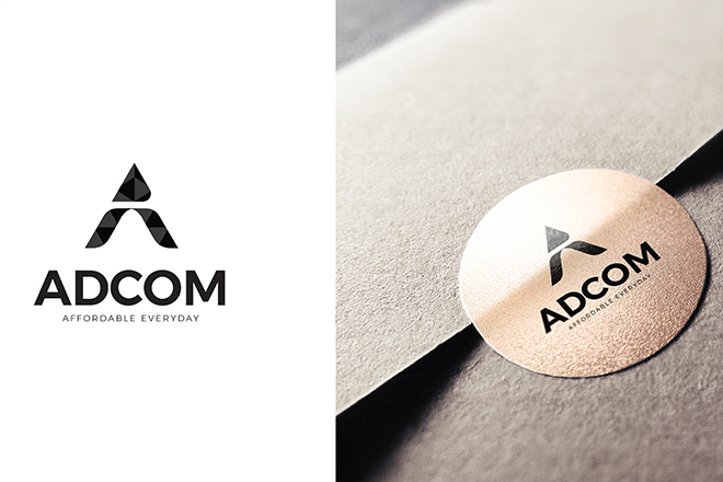
To create unique, memorable, and versatile logos that communicate brand essence and spark recognition.
| Client: | ADCOM |
| Industry : | Creative/Design Services |
| Scope : | logo and packaging design |

1. Brand Brief
Brand Name: ADCOM
Category: Creative/Design Services
Nature: Logo design & visual branding
Objective: To create unique, memorable, and versatile logos that communicate brand essence and spark recognition.
Target Audience: Startups, SMEs, and large enterprises across diverse sectors seeking strong visual identity.
Design Approach: ADCOM emphasizes clean, concept-driven, and scalable logos tailored to each brand’s story and vision.

2. Brand Typography
While specific fonts aren't detailed in the portfolio, based on visual analysis of the logos, ADCOM tends to use the following typographic styles:
• Sans-serif Typefaces: Modern, minimal, clean — used to convey professionalism and clarity.
• Geometric Fonts: Seen in tech or architecture-related logos for precision and balance.
• Custom Lettering: Several logos feature modified letterforms, emphasizing uniqueness.
Suggested Typeface Palette for Website:
• Primary: Montserrat / Poppins / Avenir
• Secondary: Lato / Open Sans / Inter
• Accent: Custom-styled logotype fonts for headings and hero elements

3. Brand Philosophy
“Design is not decoration — it’s communication.”
ADCOM believes that every logo is a story in itself. The philosophy centers around purpose-driven design, where form follows function. Each mark is built to embody a brand’s core values, resonate with the audience, and remain timeless.
Key values:
• Simplicity: Stripping away the unnecessary
• Meaning: Embedding deep relevance in each symbol
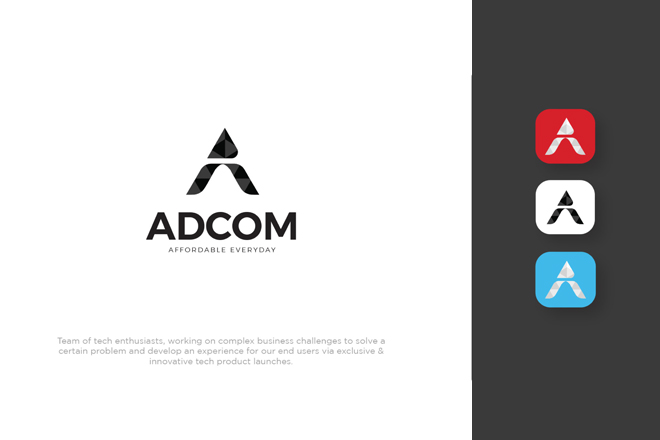
• Adaptability: Designing for both print and digital worlds
• Originality: Avoiding trends in favor of timeless distinctiveness

4. Brand Storytelling
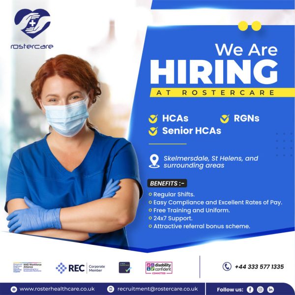
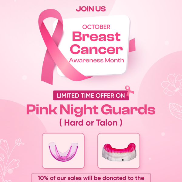
ADCOM’s logo portfolio reflects a narrative-first approach. Whether it's the upward strokes denoting progress, hidden initials within abstract forms, or culturally inspired motifs — each logo tells a distinct story.
Examples of Story Elements Found in the Logos:
• Symbolism: Shapes that hint at growth, innovation, or trust
• Typography customizations: Logos where type design reinforces the brand tone (e.g., bold for strength, lowercase for approachability)
• Negative Space: Used cleverly to integrate dual meanings or hidden messages
Each design is the visual endpoint of a deep discovery process involving research, concept sketches, and refinement — ensuring the final logo is more than a pretty mark, but a lasting identity.

5. Brand Goals
• To provide brands with logos that communicate clearly, connect emotionally, and scale effortlessly.
• To build long-term client trust through collaborative design.
• To constantly evolve while staying true to fundamental design principles.

6. Color Palette Philosophy
Although specific palettes vary per logo, general observations reveal:
• Vibrant primaries (reds, blues) for energy and attention
• Neutrals and blacks for elegance and sophistication
• Pastels where needed for softness and approachability
Each palette is chosen based on brand psychology and sector relevance.

7. Design Process (For Website Portfolio Section)
A section titled “Our Process” could outline:
1. Discovery & Briefing – Understanding the brand
2. Research & Moodboarding – Contextual + visual inspiration
3. Sketching Concepts – Exploratory ideation
4. Digital Rendering – Vector development of shortlisted concepts
5. Client Collaboration & Feedback
6. Finalization & Delivery – Full logo package

8. Website Portfolio Content Suggestions
Hero Text Example:
"We design identities that speak louder than words." Explore our curated collection of smart, scalable, and story-rich logos.
About Section Text Example:
At ADCOM, logo design is more than art — it’s strategy. Each mark we create is built from deep insight, clean geometry, and purposeful symbolism. With every curve and color, we capture the spirit of your brand.

























Leave a Reply
You must be logged in to post a comment.