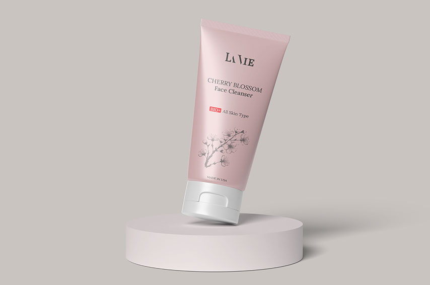
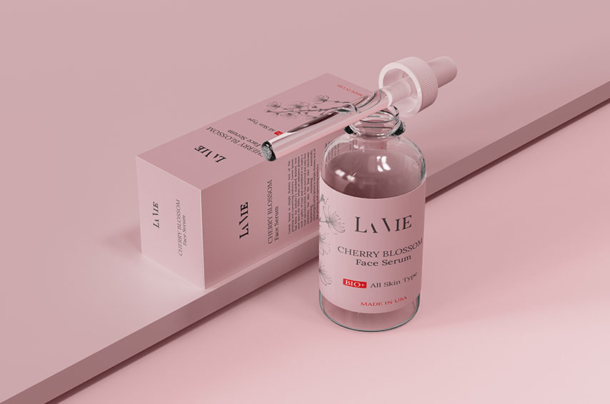
Creating Skincare Packaging & Branding
LAVIE is a contemporary cosmetic brand designed with a vision to infuse elegance, simplicity, and natural sophistication into daily beauty rituals.
| Client: | LAVIE |
| Industry : | Cosmetic |
| Scope : | logo and packaging design |

Brand Brief
LAVIE is a contemporary cosmetic brand designed with a vision to infuse elegance, simplicity, and natural sophistication into daily beauty rituals. Rooted in minimalism and crafted with a feminine touch, LAVIE speaks to individuals who appreciate clean aesthetics, eco-conscious living, and refined beauty.
The packaging and branding for LAVIE emphasize soft hues, clean lines, and understated luxury, creating an emotional connection with consumers who value authenticity, purity, and self-care.

Brand Philosophy
“Beauty in simplicity. Luxury in nature.”
LAVIE’s philosophy is centered on effortless beauty—a reflection of nature’s quiet power and the confidence found in grace and authenticity. The brand avoids visual clutter and instead embraces minimal design language to let the product and the user experience speak for themselves.

Storytelling / Brand Narrative
LAVIE was born out of a desire to reimagine cosmetics through a lens of purity and elegance. Each product is thoughtfully designed to not only enhance physical appearance but to nurture the spirit of self-love.
From the gentle color palette to the eco-friendly materials, LAVIE tells the story of a brand that cherishes quality over quantity, intention over trend, and soul over surface. It evokes the serenity of a morning ritual, the confidence of bare skin, and the comfort of authenticity.

Target Audience
• Women aged 20–40 with an interest in clean beauty, minimalist aesthetics, and ethical products
• Design-conscious consumers who appreciate refined packaging
• Individuals seeking emotional connection with brands through storytelling and self-care ethos

Visual Identity
Color Palette
• Soft Pastels: Blush pinks, nude tones, gentle whites
• Neutral Accents: Cream, soft taupe, subtle greys
These colors reflect softness, femininity, and tranquility—aligning with the brand’s values of calm and confidence.

Typography
• Primary Typeface: Elegant serif or refined sans-serif (modern, clean, feminine)
• Style: Light weights with generous spacing, emphasizing breathability and elegance
Typography is used sparingly but purposefully, echoing the brand’s minimalist approach and upscale feel.
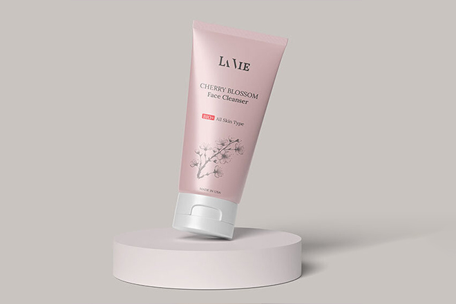
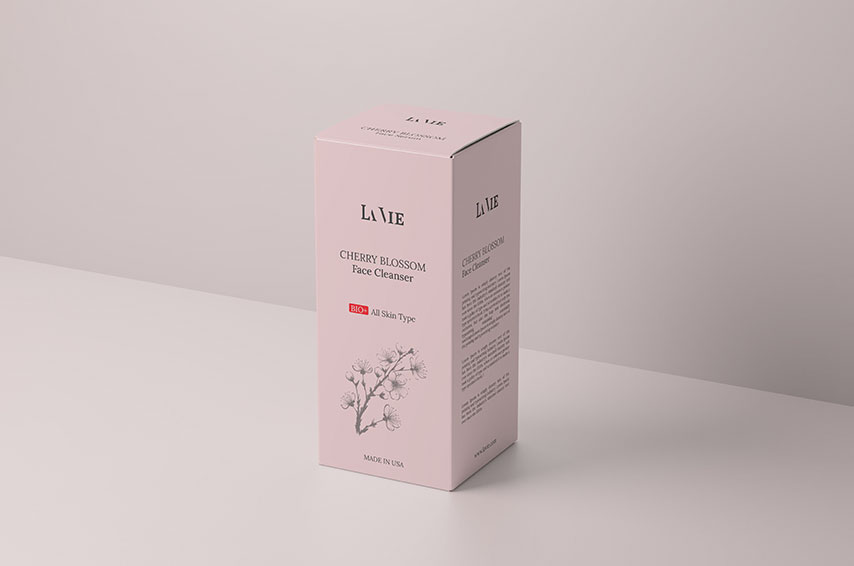
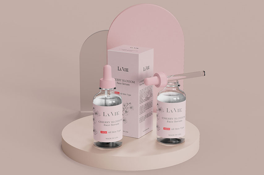
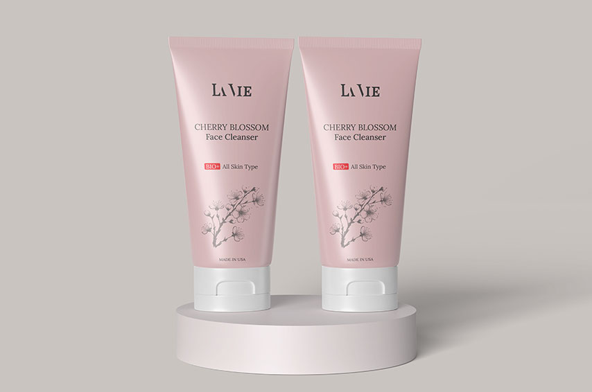
🖼 Packaging Design
• Minimalist layouts with ample negative space
• Product names in elegant fonts, often center-aligned
• Matte textures and subtle embossed elements for tactile luxury
• Sustainable materials such as recycled paper or glass

Brand Tone & Messaging
• Tone: Calm, nurturing, sophisticated
• Taglines/Descriptors:
o Nurture your natural glow
o Pure. Soft. Uncomplicated.
o LAVIE — Where less becomes more
Messaging focuses on empowering users through gentle, self-affirming language—evoking comfort, care, and clarity.

Brand Applications (Portfolio Highlights)
• Cosmetic tube and box packaging design for lotions and creams
• Minimal label designs with brand consistency across products
• A brand video or mockup showcasing the packaging in natural light settings
• Concept boards demonstrating the evolution from idea to execution

Brand Goals
• Build trust through transparency and elegant design
• Promote sustainable packaging solutions
• Establish a recognizable visual language that appeals to conscious beauty consumers


Leave a Reply
You must be logged in to post a comment.