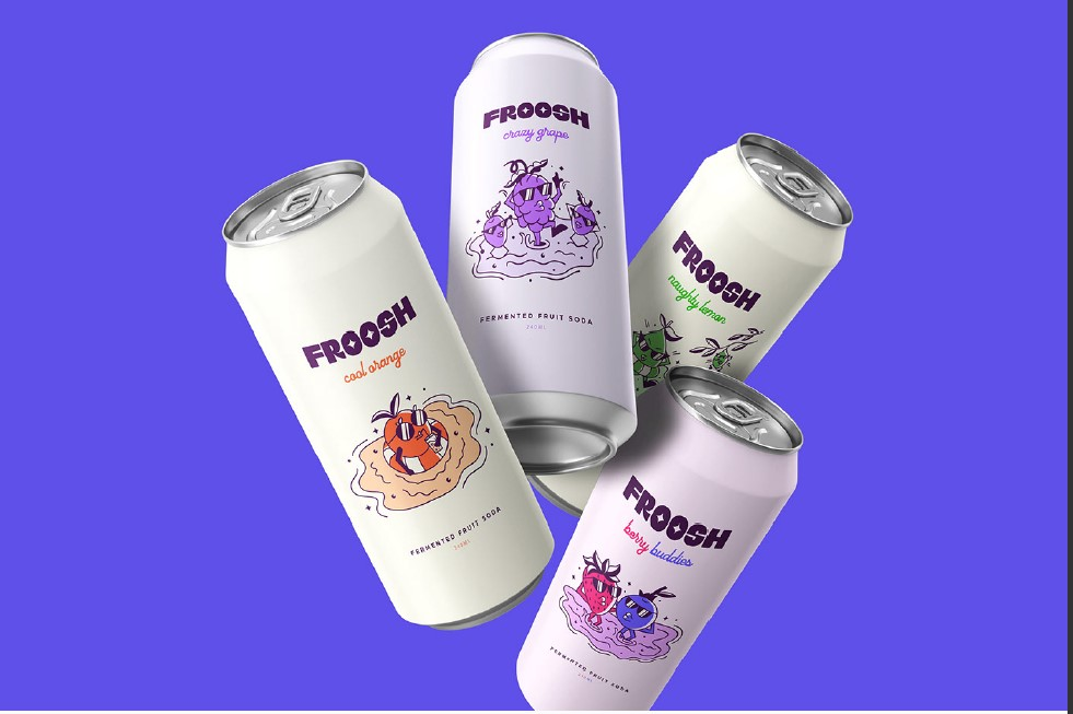
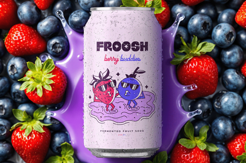
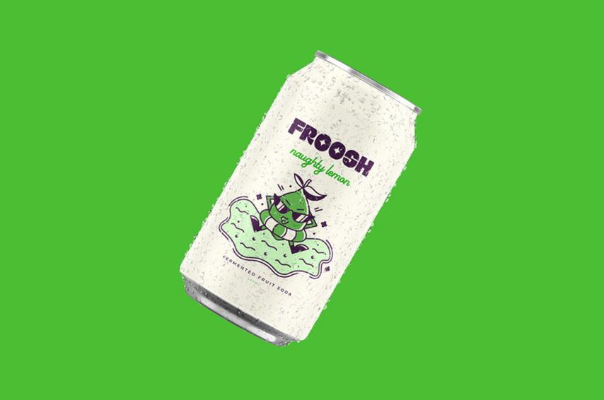
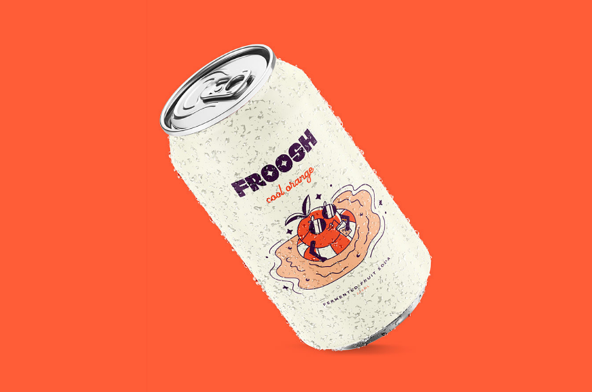
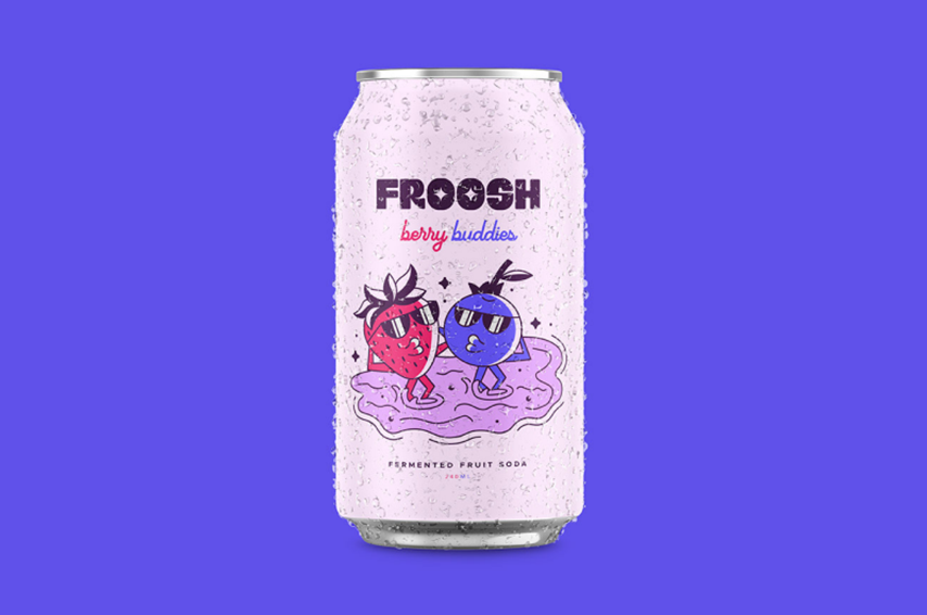
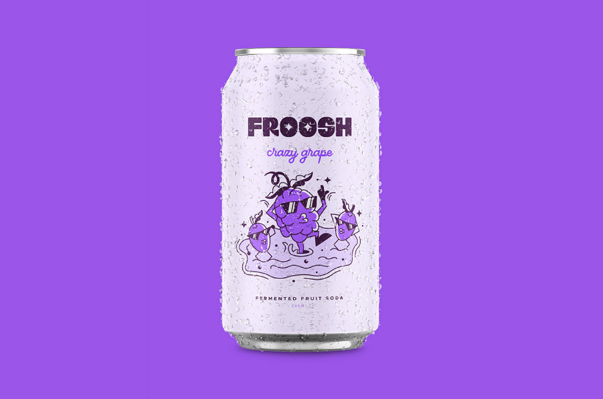
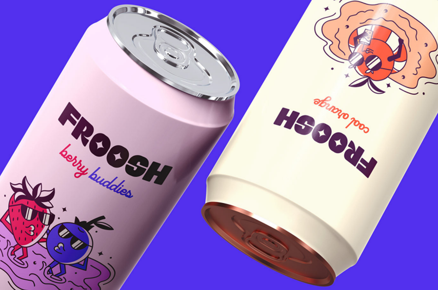
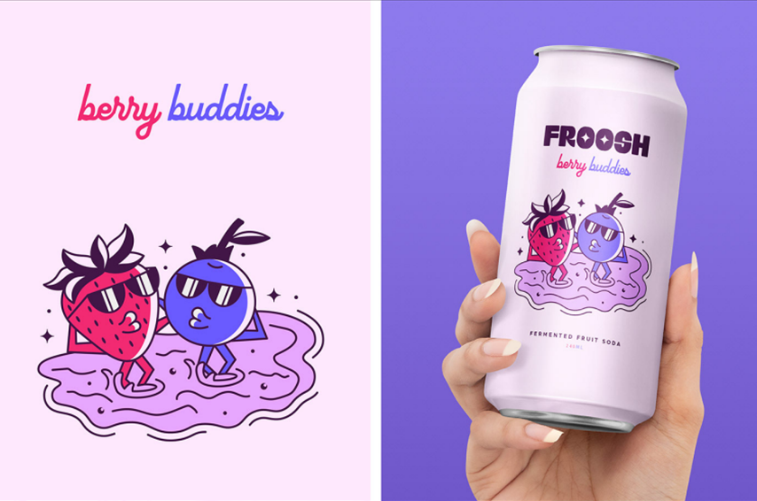
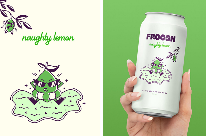
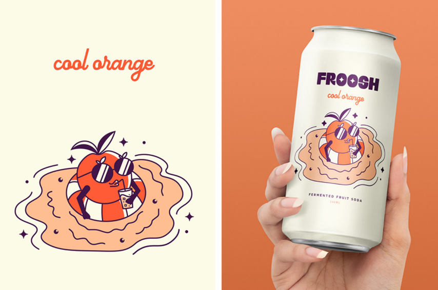
Creating FROOSH Logo & Packaging Juice Brand
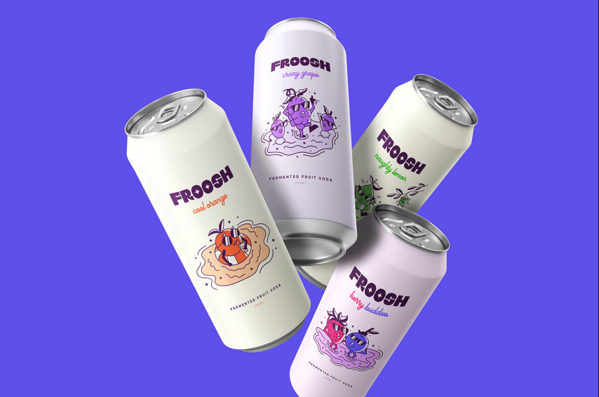
Froosh is a vibrant and refreshing fermented soda brand that blends natural flavors with effervescent fizz.
| Client: | Froosh |
| Industry : | Food & Beverage |
| Scope : | logo and packaging design |

1. Brand Name
FROOSH (A blend of “Fruit” and “Fresh” – symbolizing purity, vitality, and natural goodness)

2. Brand Tagline
“Just Fruit. Just Right.”

3. Brand Brief
FROOSH is a vibrant, health-conscious fruit juice brand focused on providing 100% natural, unadulterated fruit beverages to consumers who prioritize wellness without compromising on taste. With modern, minimalistic packaging and a bold color palette, FROOSH speaks to a young, dynamic, and eco-aware audience.

4. Brand Philosophy
FROOSH believes in nature’s simplicity. No preservatives. No sugar. No nonsense. Just fruit, in its purest, most delightful form. The brand celebrates honesty, transparency, and sustainability, ensuring every bottle is as clean in design as it is in content.

5. Brand Values
• Purity: 100% real fruit, no additives.
• Bold Simplicity: Minimal design with maximal impact.
• Sustainability: Eco-conscious packaging and ethical sourcing.
• Vibrancy: Energetic, colorful, and optimistic personality.

6. Target Audience
• Health-conscious individuals (ages 18–35)
• Urban professionals and students
• Fitness and wellness enthusiasts
• Environmentally aware consumers
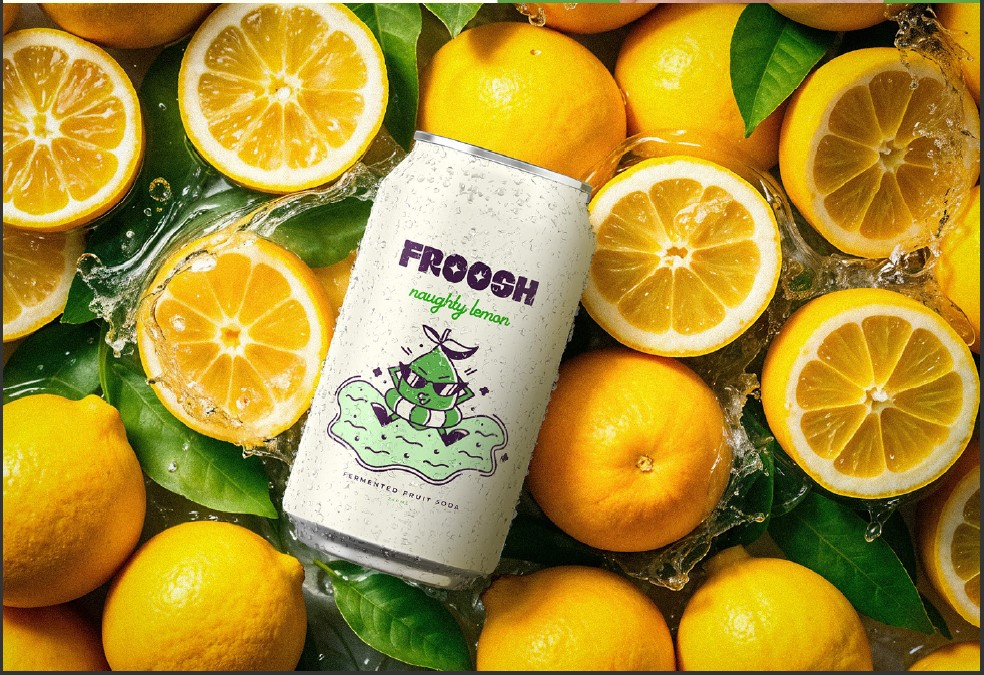
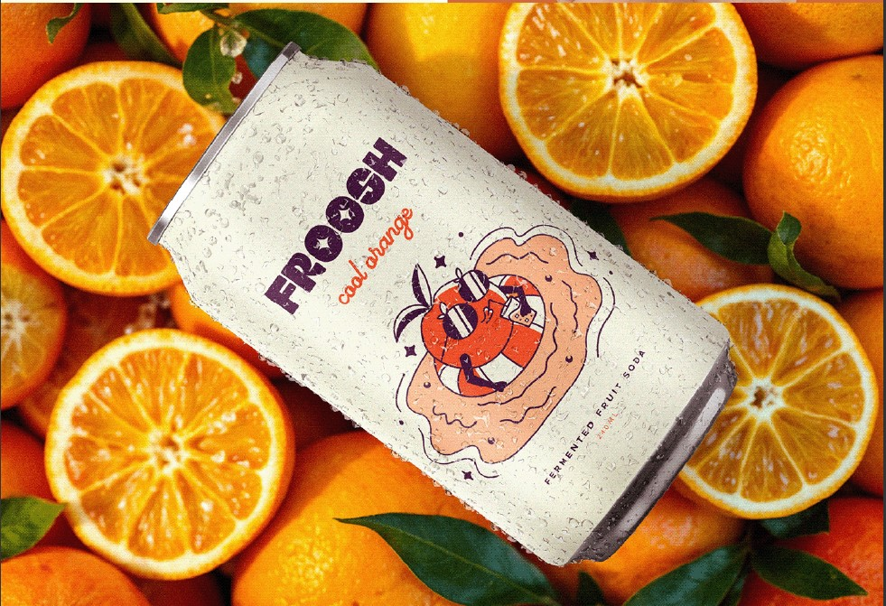
7. Visual Identity

Logo Concept
• Bold sans-serif typography in all caps for a clean and confident feel.
• Rounded letterforms to reflect freshness and friendliness.
• Colorful circle or dot elements may represent fruit drops or ingredients.

Color Palette
• Bright, fruity tones:
o Mango Yellow (#FFC933)
o Berry Pink (#FF5E90)
o Kiwi Green (#B5D56A)
o Sky Blue (#6DDDF9)
These reflect different juice flavors and evoke freshness, fun, and variety.

Brand Typography
• Primary Font: Montserrat Bold – used for headings and logo. Clean, geometric, modern.
• Secondary Font: Open Sans – used for body text and descriptions. Friendly and readable.

8. Packaging Design Language
• Clear, minimal bottle design to showcase the natural color of the juice
• Bold flavor names in white or black sans-serif text for legibility
• Minimal graphic elements – letting the juice do the talking
• Eco-friendly packaging using recyclable materials

9. Brand Storytelling
“From fruit to froosh.”
FROOSH was born from a simple idea: what if fruit juice could be as pure as picking it off a tree? We traveled orchards, blended flavors, and cut out all the fluff. What remained? Just fruit, bottled in brilliance. Every drop of Froosh tells a tale of vibrant farms, real ingredients, and zero compromise.
Whether it’s powering your morning, refreshing your gym session, or cooling you down after a hot day, Froosh is fruit that fits your lifestyle. Unfiltered. Uncomplicated. Unmistakably fresh.

10. Tone of Voice
• Fresh, clean, and conversational
• Friendly but not overly casual
• Confident and honest
• Example: “No sugar added. No weird stuff. Just real fruit doing its thing.”

11. Applications
• Product Packaging: Bottles, labels, caps
• Social Media: Instagram stories, colorful posts, fun fruit facts
• Point-of-Sale: Posters, mini fridges, tasting booths
• Website & E-commerce: Clean layout, flavor-based navigation, transparent ingredient list


Leave a Reply
You must be logged in to post a comment.