Creating Belcazzi Packaging & Branding
Luxurious, science-backed skincare and spa treatments focused on purity, precision, and holistic well-being.
| Client: | BELCAZZI DERMA SPA |
| Industry : | Skincare & Wellness |
| Scope : | logo and packaging design |

BRAND IDENTITY PROFILE
BELCAZZI DERMA SPA

1. Brand Brief
Brand Name: BELCAZZI DERMA SPA
Industry: Skincare & Wellness
Core Offering: Luxurious, science-backed skincare and spa treatments focused on purity, precision, and holistic well-being.
Essence: Where timeless beauty meets modern dermatological expertise.
Tagline: “The Art of Skin Rejuvenation.”
Tone of Voice: Elegant, clinical yet warm, premium, empowering.

2. Brand Philosophy
BELCAZZI believes that beauty is a ritual — an expression of inner balance, purity, and self-care. Rooted in clinical excellence and luxurious experience, the brand bridges the gap between medical-grade skincare and spa indulgence. Every touchpoint — from product formulation to service ambiance — echoes its belief in sustainable beauty and dermatological trust.
Core Values:
• Purity: Clean ingredients, transparent processes.
• Science: Backed by dermatological research.
• Elegance: Refined aesthetics in both experience and design.
• Empowerment: Nurturing confidence through radiant skin.

3. Storytelling: The BELCAZZI Journey
In a world overwhelmed with skincare fads, BELCAZZI emerged as a sanctuary of truth and transformation. Founded by skin specialists and luxury wellness designers, the brand was born from a simple question: “What if skin therapy could be both luxurious and clinically effective?”
Inspired by European derma-spa culture and empowered by cutting-edge cosmetic science, BELCAZZI crafts every treatment and product as a moment of renewal. It is more than skincare — it is a ritual of refinement.

4. Target Audience
BELCAZZI caters to discerning individuals who:
• Seek premium skincare solutions
• Value science-backed wellness
• Desire a spa experience that heals, not just pampers
• Embrace sustainable self-care
Demographic: Affluent urban professionals, wellness enthusiasts, skincare-conscious women and men, age 25–55.

5. Brand Typography
Primary Typeface:
• Serif – High-end, Elegant Font (e.g., Cormorant Garamond / Playfair Display) Used for headings and brand marks to convey elegance and sophistication.
Secondary Typeface:
• Sans-Serif – Clean, Modern (e.g., Lato / Montserrat) Used for body text and captions to ensure readability and a modern balance.
Font Usage Guidelines:
• Headlines should be bold, spaced, and graceful.
• Body text should reflect minimalism, professionalism, and clarity.
• Text hierarchy should align with the spa’s calming, slow-paced brand energy.

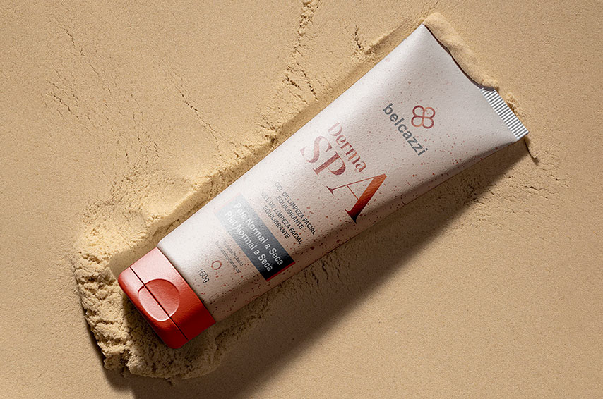
6. Color Palette
• Pearl White (#F9F8F6): Purity & freshness
• Soft Rose (#EFD9D1): Skin-tone warmth
• Slate Gray (#5A5A5A): Clinical sophistication
• Gold Accent (#C2A471): Touch of luxury
• Calming Blue (#B2C7D9): Dermatological trust

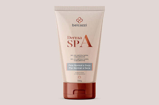
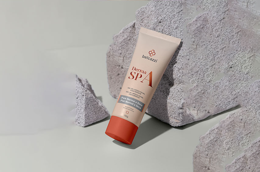
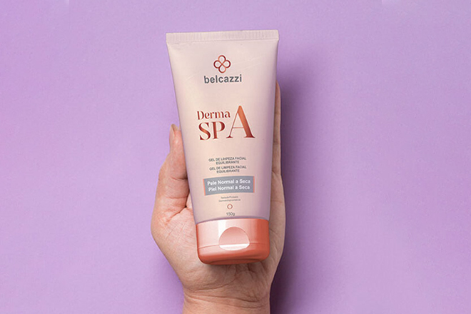
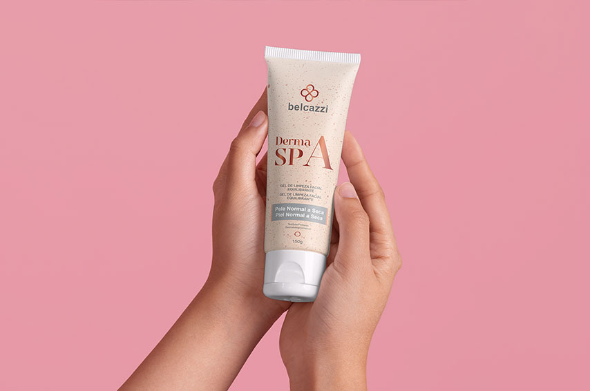
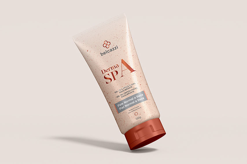
7. Logo & Visual Identity
Logo Style: Minimalist yet refined, likely featuring:
• Elegant serif typography
• Clean lines
• Possibly a monogram or emblem emphasizing luxury
Usage Tips:
• Maintain clear space around the logo
• Use in monotone or gold/white versions for luxury touchpoints
• Apply over neutral backdrops (beige, white, blush)

10. Tone of Voice
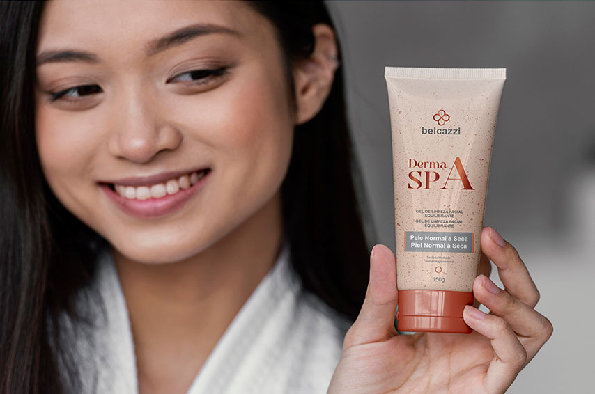
• Visual Tone: Soft-focus, dewy lighting, neutral backdrops
• Subjects: Serene women/men, close-ups of radiant skin, spa rituals in action
• Mood: Clean, fresh, luxurious, intimate
9. Website Portfolio Content Suggestions
Homepage:
• Hero image with tagline: “The Art of Skin Rejuvenation”
• Brief intro to the BELCAZZI experience
• CTA: Book Your Ritual
About Page:
• Brand story + philosophy
• Founder insights
• Behind the name: “BELCAZZI” (etymology or concept)
Services:
• Clinical facials, therapeutic treatments, product lines
• Ingredient philosophy
• Dermatologist-designed care


Leave a Reply
You must be logged in to post a comment.